

Note to Readers: For a better viewing of charts, please right click the chart image and open as a new window to view in full resolution.
At Jadara Capital Partners, when investing across emerging and frontier markets, we spend as much time analyzing countries as we do analyzing sectors and companies. In emerging market investing, we believe the country risk premium tends to be a driving factor for long run investment returns (and alpha), so solving for the country risk/return metrics becomes an essential part of picking outperforming stocks that don’t get caught up in a bad macro environment.
Much has been written on this subject (see a recent GMO note on the topic titled ‘Top-Down Investing in Emerging Market Equities’) and there is quite a bit of empirical evidence that supports the contention that the top-down factors (currency, macro growth, inflation, governance – to name a few) tend to drive a disproportionate portion of returns over the medium and long term. This is especially true as you go down the efficiency and investability spectrum – the least efficient & least accessible markets (for foreign investors – whether because of liquidity, market size or capital controls) in the least integrated economies across the emerging world, tend to be dominated by domestic-driven sectors and companies (e.g. banks, telcos, food & beverage, cement, etc.) with a very small representation by globally-integrated and competitive industries (technology, MNCs, large exporters). Globally integrated franchises, because they compete on a multinational setting, tend to get benchmarked and valued relative to international peers. More importantly, these companies tend to have a lower exposure to their home market, while in some cases (e.g. exporters) can benefit from a weak local macro backdrop (e.g. weak home currency vs the US$). This is a long-winded explanation for why the top-down is crucial for anyone investing in emerging and frontier markets and why we spend so much time studying countries.
In order to perform country analysis in a systematic and disciplined fashion, we adopted and refined a top-down country framework over the past couple of decades that has worked well for us – not just in picking ‘winner’ countries, but also (and far more importantly) avoiding ‘land mine’ countries that blow up intermittently. We believe investing is mostly about preserving one’s capital from permanent loss while maximizing exposure to high return/risk asymmetric propositions. From a risk standpoint, merely dodging land mines is such a crucial task. We believe if done successfully, just avoiding land mines will get you at least half way to preserving capital and generating competitive returns. The other half lies in the return side of the equation and in picking the big ‘break-out’ countries (to borrow a label from MSIM’s – Ruchir Sharma).

The framework we have adopted (Chart 1 above) is pretty straight forward – 3 big factor categories (Dynamics, Valuation & Sentiment) each with their own sub-factor-categories, some of which are gating factors for us (e.g. Rule of Law & Governance). We will not invest in a country that has poor overall governance (e.g. human rights, socio-economic track record, failing social contract) and will stay clear of countries that do not protect property rights or have weak judicial infrastructure. On the positive selection side, we are looking for countries with a sustainable national comparative advantage that is demonstrated through sector leadership in a global context. This factor specifically addresses the question of ‘what is the country’s overall long run strategy and development model’ and how does the country truly stand out in a global context?
All of the factors are analyzed dynamically- so we are not just interested in where the country stands now across these dimensions (vs. others) but what is the trend. On this last point, analysis of the reform and capital efficiency profiles are quite important. What has the direction and pace of reforms been of late and what really anchors these reform policies (how strong are the anchors?). On capital efficiency, we look at both the availability and cost of capital in the country and study the drivers for abundance or shortage and how the country has managed its growth in light if these factors. Finally, we have a strong overwhelming bias for scalable growth opportunities that are offered by either large domestic markets (big populations) or (in a handful of cases) smaller countries that position themselves as regional or global hubs catering to a large, somewhat captive global markets (e.g. Singapore, Ireland, Hong Kong or Dubai). In the Dynamics category – we are essentially trying to identify (and ‘solve for’) those countries that are successfully undergoing big structural transitions.
The top-down framework is more than just a check list, it is also a road map and is akin to a recipe’s key ingredients. The factors are not guidelines, they are essential bedrocks of analysis that help us concentrate our analytical resources on where we think they will be most effective. The framework is also dynamic – so the grading/scoring can and will change and our convictions and relative scoring will change as a result (we force rank all of our countries against one another every quarter).
In the Valuation category, we are ‘solving for’ the true national cost of capital and therefore the implied risk premium for the country (e.g. relative to the US or a developed world benchmark). This dovetails nicely with the overall country’s culture of capital efficiency, but is empirically analyzed here through aggregate country bond and stock valuations. What have the long run returns on capital been relative to the cost of capital (EVA or ‘Economic Value Added’) in the country in aggregate and relative to its growth profile? Has this competitive EVA been generated despite a high cost of capital (e.g. in capital-short countries like India or Turkey) or is it more a function of abundant & cheap capital that may be subsidized or misallocated? Finally, we decompose the aggregate risk premia into their endogenous components – political/social risks, inflation/currency, debt profile, fiscal profile, and assess their directionality and weights.
We then analyze the third pillar of Sentiment, which tends to be the ‘softest’ factor to assess. Liquidity is obviously both a driver and contributor to sentiment, while research coverage, investor positioning and structural neglect (e.g. capital controls, off benchmark status, “too dangerous to visit”, etc.) are also considered. For each of the big three factor-categories, we then map out visible catalysts for change at the margin along with key milestones that we track closely.
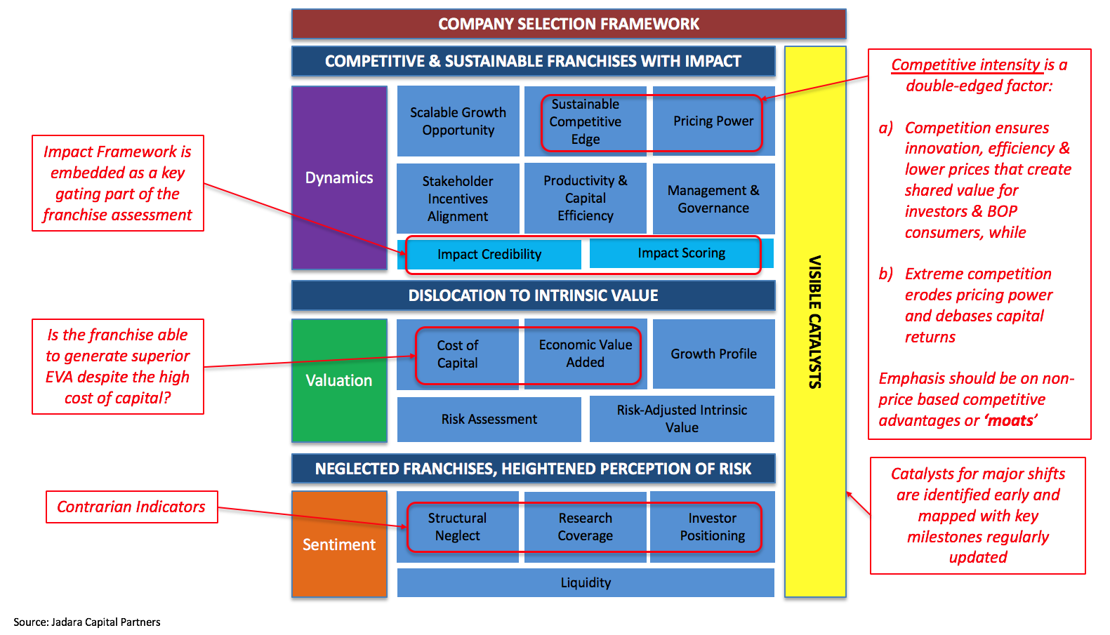
Because at least half of our brains are also picking stocks, it is important that our top-down framework is in sync and almost rhymes with our bottom-up framework (see Chart 2 above). For company selection, we use the same framework structure and factor-emphasis (e.g. scalable growth opportunity, sustainable competitive edge, governance, etc.) which makes the process much more intuitive and consistent for our team (we are all using the same general lens for countries as well as for company franchises). More on this bottom-up framework in later posts; we will focus on top down in this note.
Having described our country selection framework at length and contrasted it to our company framework, we can now address the central question at hand in this post – can or should investors look at countries in the same manner as they look at companies and their stocks?
We obviously believe in the affirmative, but there are two big obstacles that need to be overcome in order to do this effectively.
First, country accounting is very different than company accounting. Country accounting is much more concentrated on flows (e.g. GDP, money supply, savings, fiscal spending, etc. – or akin to the income statement and cash flows of a franchise) and much less so on the asset side of the balance sheet (particularly the capital deployed – or the denominator in any Return on Capital calculus). As a result, country data provides only a partial picture of a nation’s economic health, potential for future growth and (most importantly) how efficiently and productively capital is being deployed. We are all quite familiar with the liability side of a nation’s balance sheet (and some of the transparent financial assets), but don’t have great data on other real assets that make up the bulk of the productive capacity of countries. As a result, we don’t really have a great handle on what a country’s net worth or equity is. This is equally true for resource-intensive countries as it is for service-intensive countries – we don’t really know how the respective national assets are being ‘sweated’. At the end of the day, assets are what enable countries to generate future income and growth. [Don’t even get us started on productivity economics – or ‘TFP’ since we remain big skeptics (topic for another note)].
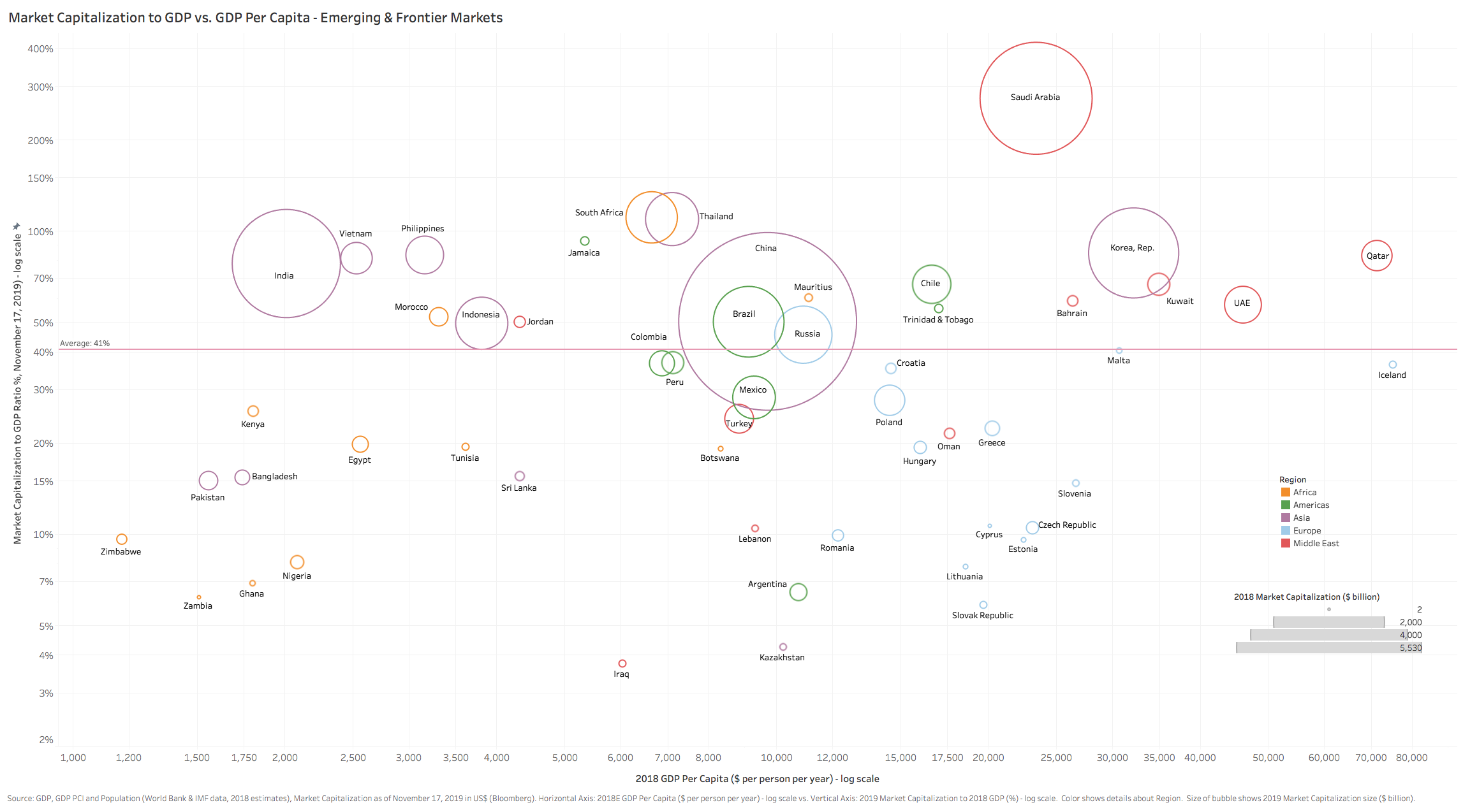
Secondly, emerging capital markets tend to be very narrow and only represent a very small percent of the total economic picture for most countries. Evidence of this is the low 41% average market capitalization to GDP ratio for EM/FM markets (Chart 3 below, data as of November 2019 which are materially lower now). For many emerging countries, stock markets only represent 5%-15% of their respective GDPs (the ratio itself is inherently flawed as it measures a ‘stock’ – the country market capitalization versus a ‘flow’ – country GDP). As a result, looking only at the capital markets for clues about true capital efficiency and returns only gives you a very small sample of reality, in some cases this can be quite misleading (positive or negative selection bias at play).
In order to overcome these two obstacles, we have tried to assess the asset- and wealth- sides of a country more holistically. This is, to say the least, a very challenging feat for most countries and an even bigger challenge to try and make an analysis systematic and consistent so that it is credibly comparable across a large set of countries.
Fast forward to 2018, and we were elated to learn that the World Bank had finally undertaken this challenge head on and started to publish data on comprehensive country ‘wealth’ in a report titled ‘The Changing Wealth of Nations’. In the report, the authors define ‘wealth’ as the sum of human capital, natural capital, produced capital and net foreign assets (or liabilities). What is refreshing about their methodology is that it is bottom-up so there is an empirical rigor associated with tabulating and calculating the true stock of assets. Much of this is done by sourcing asset assessments from experts (e.g. national real estate registers or the IEA for hydrocarbon deposits) while the human capital is assessed through detailed labor and household surveys (we can all thank the Gates Foundation for funding these incredibly important surveys in many emerging markets like Nigeria where primary asset data is scant). For readers who want to dig more into this topic but don’t necessarily want to spend too much time – see a good summary posted in 2018 by the folks at Our World in Data.
Below is a detailed definition of each of the major ‘wealth capital’ components (from the World Bank).

This ‘wealth’ figure should at least provide a broad basis for the comprehensive deployed capital of a nation which we will use as a proxy for a country’s equity capital- roughly analogous to the total shareholders’ equity of a company if you consider each citizen a shareholder with political (voting rights) and economic (dividends, capital appreciation) claims to this equity.
That takes care of the denominator for ROC. As for the numerator, we decided to hone in on the Adjusted Net National Income (ANNI) for each country (see below an exerpt from the World Bank’s definition for ANNI):
“Adjusted net national income is calculated by subtracting from GNI a charge for the consumption of fixed capital (a calculation that yields net national income) and for the depletion of natural resources. The deduction for the depletion of natural resources, which covers net forest depletion, energy depletion, and mineral depletion, reflects the decline in asset values associated with the extraction and harvesting of natural resources. This is analogous to depreciation of fixed assets. It complements gross national income (GNI) in assessing economic progress by providing a broader measure of national income that accounts for the depletion of natural resources….and is particularly useful in monitoring low-income, resource-rich economies, like many countries in Sub-Saharan Africa, because such economies often see large natural resources depletion as well as substantial exports of resource rents to foreign mining companies. For recent years adjusted net national income gives a picture of economic growth that is strikingly different from the one provided by GDP. The key to increasing future consumption and thus the standard of living lies in increasing national wealth – including not only the traditional measures of capital (such as produced and human capital), but also natural capital. Natural capital comprises such assets as land, forests, and subsoil resources. All three types of capital are key to sustaining economic growth. By accounting for the consumption of fixed and natural capital depletion, adjusted net national income better measures the income available for consumption or for investment to increase a country’s future consumption. Adjusted net national income differs from the adjustments made in the calculation of adjusted net savings, by not accounting for investments in human capital or the damages from pollution.”
Of all the metrics provided by the World Bank, we found that the ANNI most closely resembles a company’s cash flows since it deducts from gross income (GNI/GNP) the capital expenditures used to replenish fixed and other forms of physical capital (they exclude human capital which is not capitalized). In most cases, the ANNI deviates somewhat from GNI, itself a close proxy for GDP, but includes net income from abroad which can be material for big exporters. This however is only to the extent that the country is a very resource intensive exporter, in which case the ANNI can be meaningfully lower than GDP. In light of the fact that resource assets are theoretically finite and exhaustible, the ANNI is a much more realistic representation of the sustainable income generation of a country.
So with ANNI as our numerator for the ROC calculus, we are now armed with data that will allow us to assess at least a broad comparable metric for return on capital for a country, thereby solving for comprehensive capital efficiency on a holistic national level. Below are a few charts that illustrate these findings.
Chart 5 above ranks countries by national Return on Capital or ‘ROC’ (Adjusted Net National Income or ‘ANNI’ / Total National Wealth or ‘TW’) using the latest data available. The world average is 5.7% which we will conveniently use as our benchmark hurdle. There are some surprises here, especially with several countries that have pursued unsustainable economic strategies. On the top of the ranking, the likes of Lebanon, Jordan, Greece and Argentina all immediately pop out. These countries all binged on debt of late which likely boosted their ROCs unsustainably as of 2014 (we know how most of these stories have played out by 2020). Others that have lower national gearing (India, Philippines and Bangladesh for example) are in the enviable league of high ROC earners due more to growth in ANNI than other factors. The bottom rung is also noteworthy, crowded with big capital-intensive (mainly resource intensive) countries – Russia, Nigeria, GCC states. Many questions surface too: Why is Turkey such a large positive outlier on ROC? Why are the likes of China and Brazil underperforming the World despite above average growth in the past 20 years?

Decomposing the ROC into numerator and denominator (Chart 7 below) yields some interesting insights into which countries are the most capital intensive in aggregate wealth dollars and the sheer difference in scale (both charts are in log scale) with the US harnessing $314 trillion in wealth vs. Germany, France and the UK at only a fifth of the size.
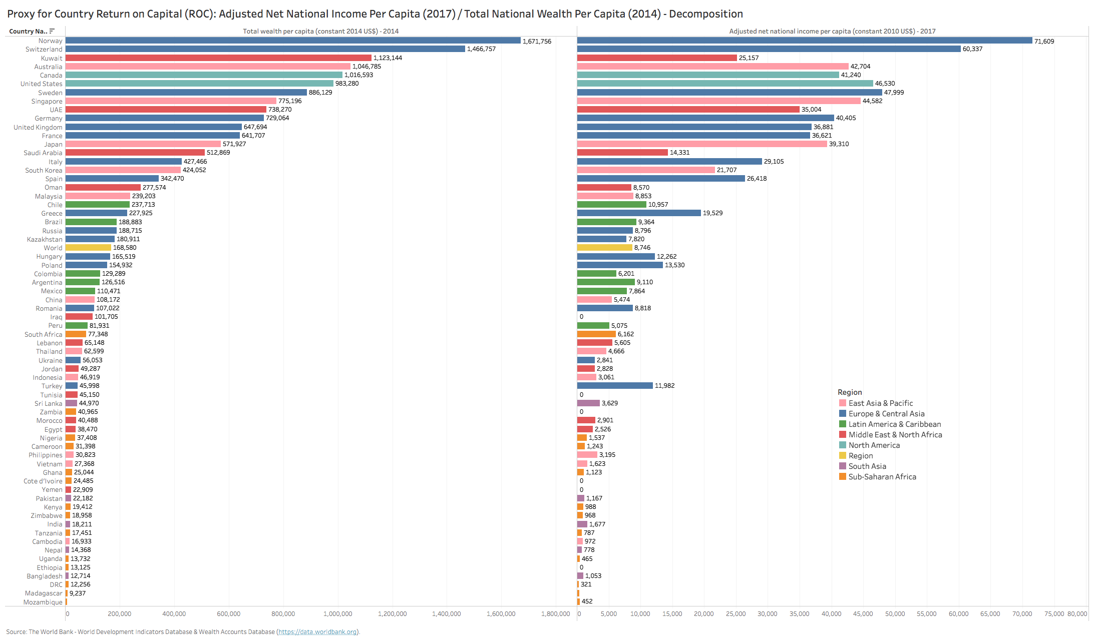
On a per capita basis, the two components of ROC make more intuitive sense (almost like a company’s book value per shareholder). Here the differential between the US & Canada is marginal (both roughly $1 million in wealth per person). The top 20 rank on total wealth per capita is however made up predominantly by rich European, Asian and GCC countries – not at all surprising, especially due to the relatively small populations for many of them. What does become clearer is how low the ANNI is relative to TW for the GCC countries (red bars) all earning very low incomes relative to their enormous wealth – a confirmation of poor productivity reflected in the bottom decile ROC rankings. Turkey, Greece, Spain and Italy all appear to have generated outsized ANNI relative to their capital base – further explaining their high ROCs.

Now overlay this with growth trends (Chart 8 above) and the narrative begins to become even clearer – countries that are growing their ANNI at a higher rate than growth in their deployed capital (e.g. Romania, Turkey, Brazil, China, Vietnam, Nigeria and even Ukraine) are showing positive trends in successively higher ROCs since 1995 (Chart 9 below illustrates this on a sequential country-by-country basis). The laggards, with deteriorating ROC trends, include countries like Chile, Bangladesh, Thailand, Morocco and Saudi Arabia.

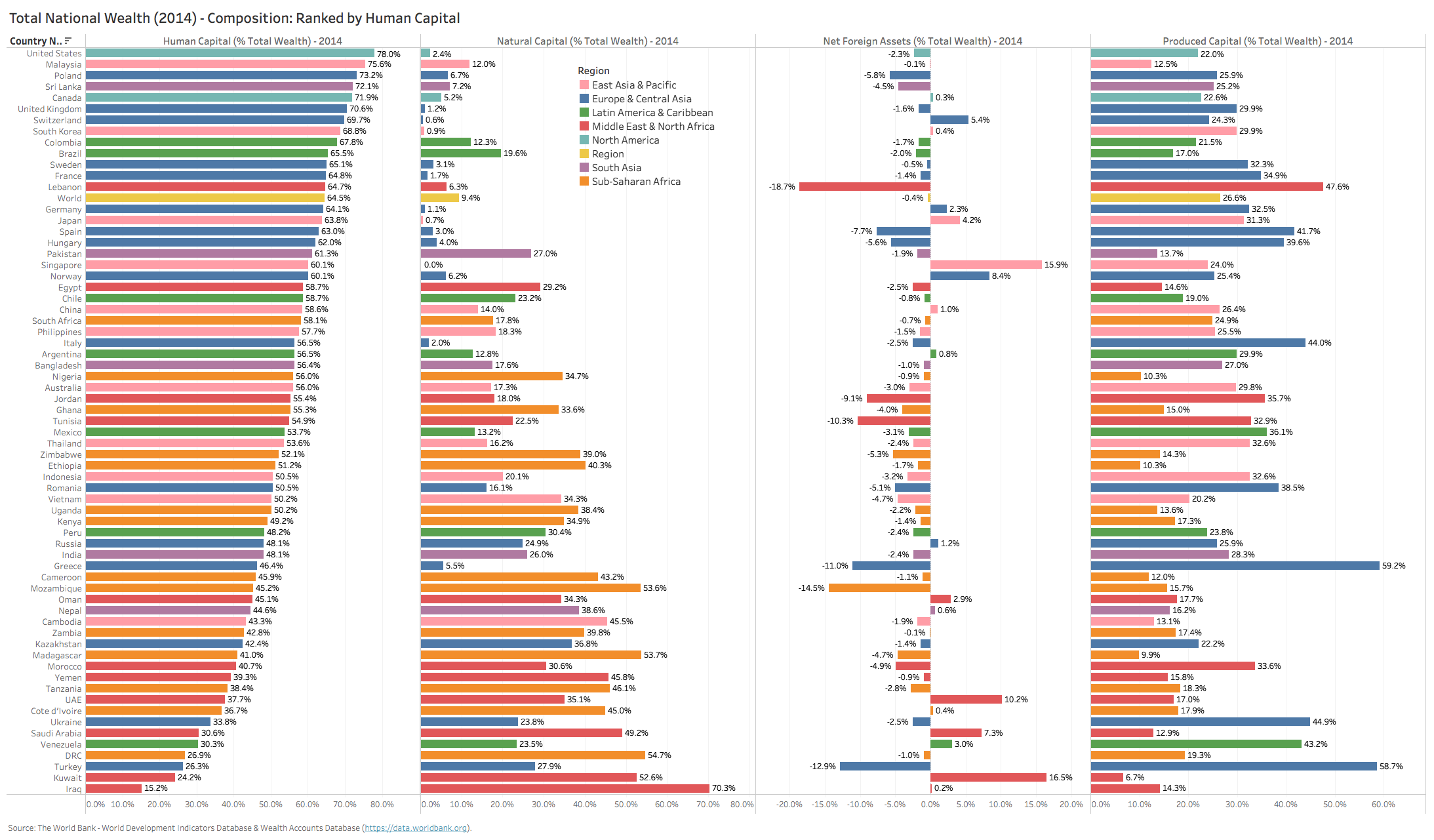
Now on to the important aspect of capital allocation. The 2014 snapshot composition of total wealth by country is quite interesting (Chart 10 below, we ranked countries by share of human capital which tends to be the dominant capital class for successful models). This highlights how capital is being allocated by each country and may provide some hints as to why their ROCs are high or low (we assume produced capital or human capital, on balance, should earn a superior return to natural assets).
Of note are the countries that lead in share of produced capital (Greece, Turkey, Italy, Romania, Ukraine) versus those that top the ranks in terms of share of natural capital (Iraq, Kuwait, Saudi Arabia, Mozambique, Tanzania and Ethiopia). Finally, the net foreign asset (‘NFA’) share is also telling, highlighting those countries that aggressively financed their growth (Turkey, Mozambique, Greece, Tunisia, Jordan, and top-ranked Lebanon). Surplus NFA countries with large shares of wealth are not surprising – Singapore, UAE, Kuwait, Saudi Arabia, Norway & Switzerland) – all are countries with substantial sovereign wealth funds that deploy excess capital actively in offshore global markets.

How have these shares of wealth evolved in the past two decades and what shifts are discernible? Chart 12 below shows the 19-year (1995 to 2014) delta in share of wealth capital by country (ranked by the delta in human capital). Those countries deploying away from natural capital and into human and produced capital include: Nigeria, Ethiopia, Ghana, Tanzania, Sri Lanka and even Jordan. Those countries who are deploying in the opposite manner (away from human and productive, into natural) populate the bottom half of the chart – Iraq, Kuwait, Morocco, Saudi Arabia, Oman, UAE.
What is especially noteworthy is that the GCC countries in this sample are also allocating aggressively away from produced capital (along with Kazakhstan and Russia). This shifting asset mix into less productive capital classes goes a long way to explaining why their ROCs are not only very low, but continue to deteriorate.
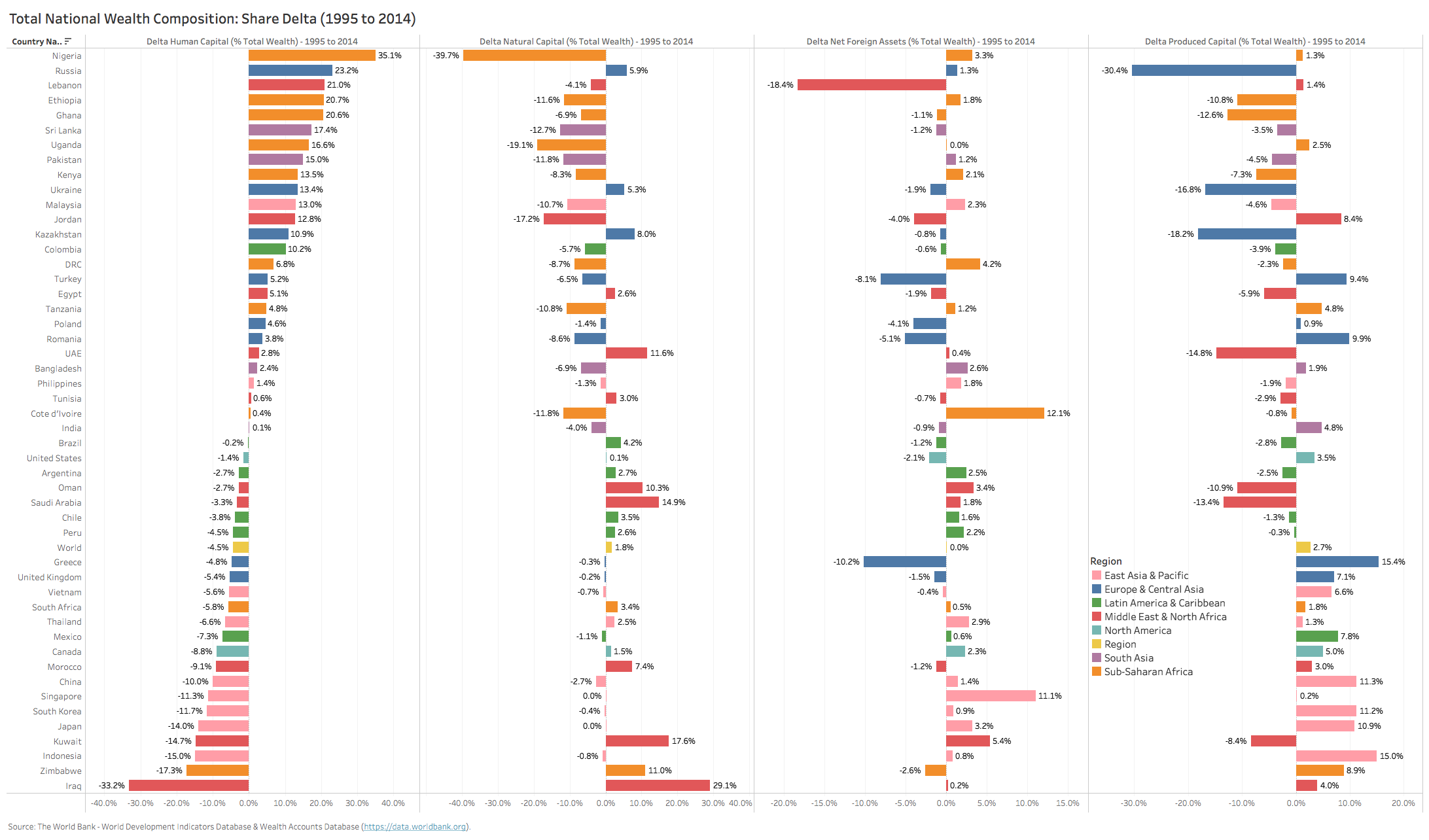
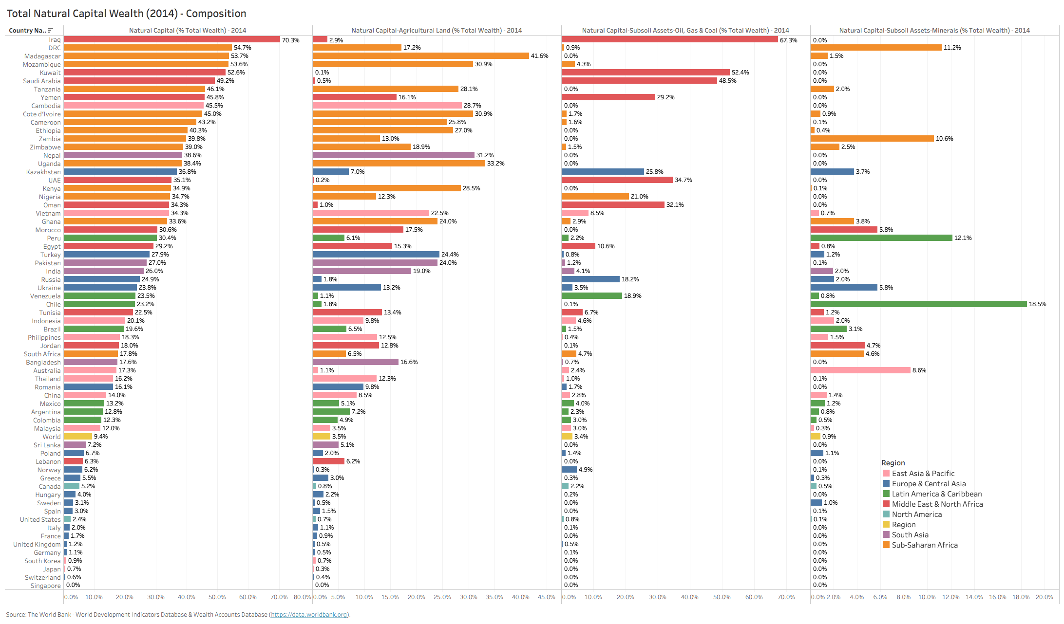
For those countries with a disproportionate weight (say > 35%) of their wealth in natural capital (Chart 13 below), they are distributed roughly evenly by those with a) large endowments of hydrocarbons (GCC, Iraq, Kazakhstan), b) those with large endowments of agricultural land (Madagascar, Mozambique, Tanzania, Uganda, Cote d’Ivoire) and c) those with large mineral deposits (DRC, Zimbabwe, Peru and Chile).
Finally, zooming in on the last decade of ROC performance (2005/7-2014/17), and looking at per capita ANNI growth vs. per capita wealth growth, one can see the quadrants of outperformance and underperformance more clearly. Countries below the curve are growing their wealth capital at a higher growth rate vs. their income (above the line the opposite). If one were to draw an analogy here to EPS growth (ANNI PC growth) and Asset growth (TW PC growth), it becomes all too evident which countries are debasing their capital versus those that are sweating their assets most. South Asia countries (for the most part) as well as most East Asian developing countries lead the rankings here, with the likes of India, Indonesia, Vietnam and Bangladesh firmly in the high growth/high EVA quadrant. Meanwhile on the opposite side of the spectrum, the GCC, Russia, the majority of developed Europe, South Africa and Nigeria are printing low income growth (highly negative in real terms for many) whilst debasing their per capita wealth.

So that is the holistic national ROC perspective. We find this a very useful construct to identify the countries that have structural strengths or weaknesses in how they treat their citizens’ equity, whether because of disappointing growth models on the income side or because of chronic misallocation of national capital.
However, if the country’s capital markets represent only a slither of this national wealth profile, it is obviously important to look at the market level dynamics through the lens of the stock markets in order to assess this cross-section of the real economy. Many will argue that stock markets represent the purest form of ‘negative selection’ in that companies that choose to list, invariably are serial, net-consumers of capital (implying that they are not able to generate sufficient capital internally from free cash flows or through senior classes of capital – e.g. debt) which in turn forces them to list and dilute their equity ownership. While we agree this may be true for some franchises, we also believe that stock markets also offer a unique avenue for high-growth and moderately capital-intensive companies to fund their growth when they are smaller, less known/credit-worthy and thus unable to attract debt financing. Equity market listing also enables companies to better institutionalize their governance and ownership and is also generally a very positive public-relations booster for consumer-facing companies.
We mention this point so that one keeps a proper perspective when evaluating a country’s stock market dynamics relative to the national profile, especially since stock markets across the developing world tend to be quite narrow in breadth. If a country’s stock market is dominated by highly capital-intensive, serial capital issuers that do not grow, invariably the country’s market returns will look far inferior to that of the real economy and vice versa.
The next set of charts draw the picture out for stock markets in detail based on current and historical aggregate equity market data. We defaulted to use MSCI indexes for each country (when available) and used domestic market indexes when not. All indexes are market capitalization weighted in their construct.

Chart 15 above ranks markets based on return on equity (ROE) and return on assets (ROA). When contrasting the stock market ROC ranking with the national ROC ranking, several things become apparent. First, quite a few of the top decile countries on the national ranking do not make the cut for the market ranking (e.g. Turkey, Lebanon, Greece, Egypt and many others). One of the reasons is likely the representation issue (stock market index only represents a small fraction of the total economy). This is especially the case for the likes of Egypt, Greece, Sri Lanka, Kenya and Lebanon where less than a handful of stocks constitute the super-majority of a market’s capitalization-weighted index (e.g. CIB in Egypt and Safaricom in Kenya with weights north of 25%). The second reason is the skew of the mix of capital being deployed for each. Turkey is a good example in this case, since the stock market is quite broad and somewhat representative of the economy (MC/GDP of close to 30%), but since the ROC for stocks is materially lower than that for the overall country, it therefore suggests that non-listed franchises may be dramatically more leveraged (high negative NFA) or simply because they are far more productive with the capital they employ than listed names (high produced capital).
On the flip side of the rankings (lower deciles) the consistency of poor ROCs across both stock markets and economies lies mainly with resource intensive countries (e.g. GCC, Russia, Zimbabwe) suggesting that market representation is less of an issue for these countries (Russia MC/GDP is 45%, while all GCC countries excluding Oman are well north of 50%, with some like Saudi Arabia post the 2019 Aramco IPO now at >220%). Here the consistency of lower decile returns for both market and nation is most likely due to the highly tilted weight of deployed capital in low return natural assets and a high dependency on resource rents that lubricates and drives growth even in non-resource sectors of the economies (e.g. banks, consumer spending, government spending, construction, etc.).
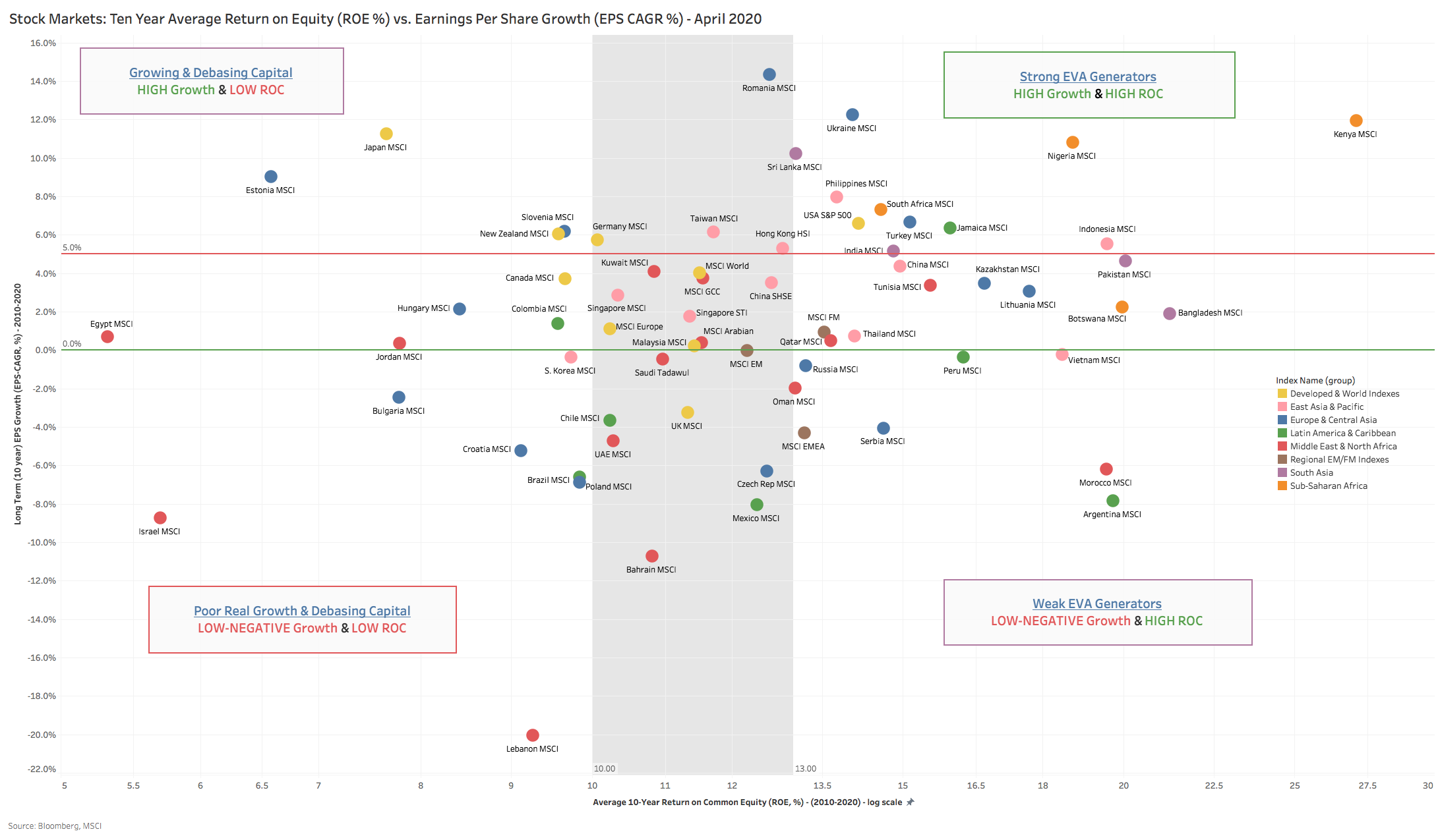
Chart 16 above plots countries on a similar matrix that we used to look at country ROC profiles (Chart 14 above) where the analog between Earnings Per Share and ANNI per capita is made and where the delta in wealth per unit for the country (TW per capita) is represented by the market ROE (a proxy for Book Value per shareholder in a company). Here the consistency across both planes is much more evident – South Asian countries cluster in the top right quadrants in both (high income growers, high wealth generators). There is also quite a bit of consistency in the bottom left quadrant (low growers, debasers of wealth), with the majority of MENA countries sitting in this quadrant.

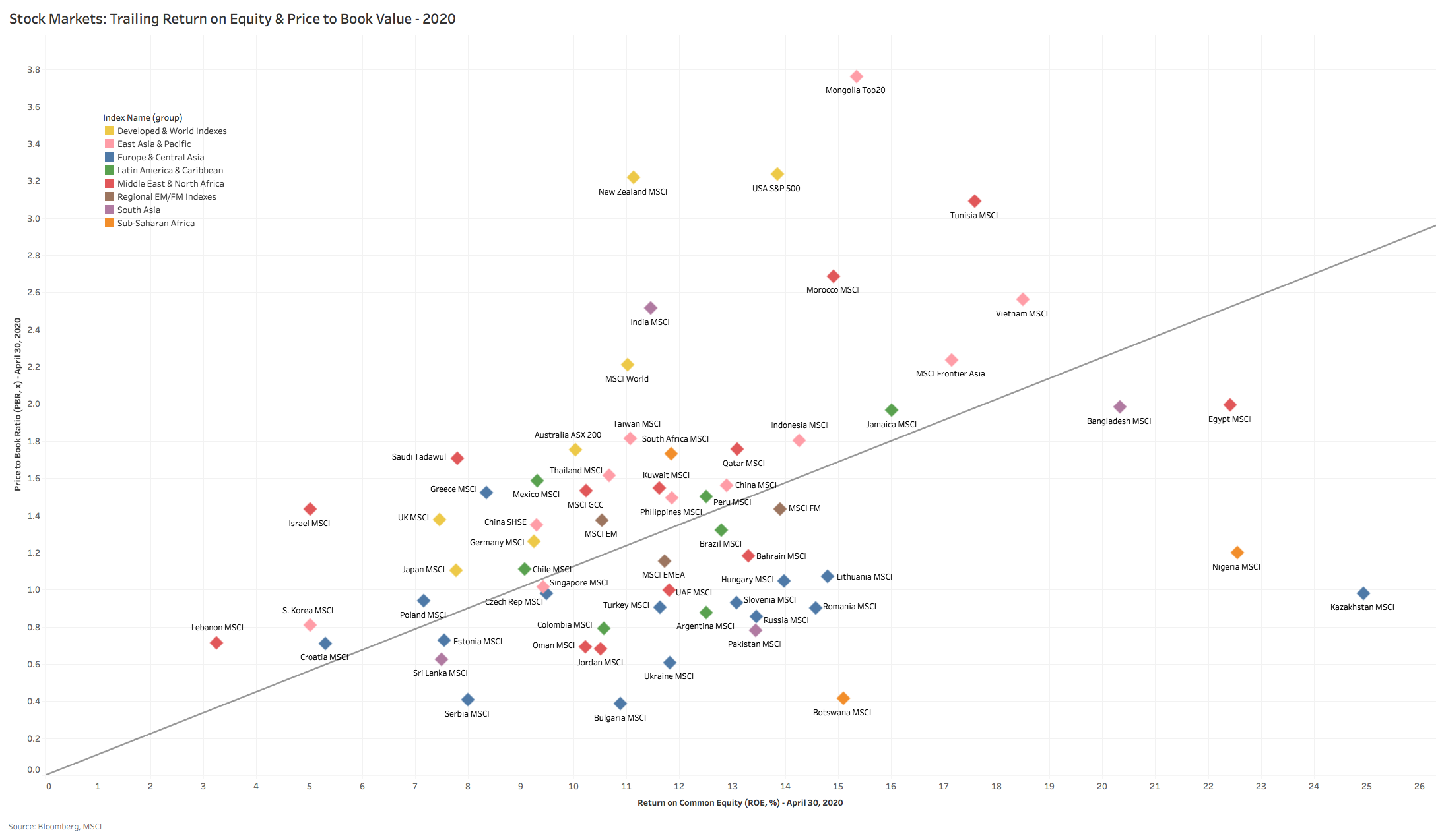
Finally, a quick look at stock market valuations (Chart 17 above and 18 below). This is useful to gauge how stock market ratings reflect their respective dynamics and if there are dislocations between reality and perception. While static snapshots are somewhat useful in benchmarking relative valuations, we tend to give much more weight to longer horizon metrics (10 years) which tend to smooth out cyclicality and bouts of euphoria and panic from ratings.
Chart 18 illustrates this nicely, with trailing 10-year average ROE plotted against current Price to Book Value. Markets above the line are over-rated relative to long-run historical ROE, while those below the line are under-rated (all else equal). Here we tend to focus on markets that are highly dislocated relative to their long-run EVA track record, and are particularly interested in those with strong structural country ROC profiles (e.g. Bangladesh, Nigeria and Egypt – to name only a few).

One thought on “If we viewed a country through the prism of a publicly listed company – would you invest in its stock?”